TESTING
Testing the features
We did a soft-launch and released the app to a closed list of stakeholders, family & friends, interns, totaling 15 people. Here's some areas we received feedback or noticed needed improvements:
According to users:
-
The arrow, originally intended for saving items, was also critiqued because it was an unfamiliar icon to users. The functionality was unclear.
-
"What does the arrow mean?"
-
-
Users needed more feedback for saved items
-
"What happens when I save this? Where does it go?"
-
"What is the purpose of the 'My Festival' page?"
-
-
Users thought the experience was disrupted when the menu took over the entire page, rather than the half-page menu they were expecting
According to developers:
-
Time constraints limited us in application functionality
-
No push notifications
-
Text spacing on the MidWay thought bubbles [on the map page
-
01. The arrow isn't the familiar icon for saving items
02. User's aren't sure what the point of saving items is
03. The full-page menu was disrupting the experience
04. Time constraints + feedback led to more simplification of functionality and UI
UX Case Studies
Duration
4 month
Role
Product Designer
Project Type
End-to-end mobile application + live stream festival
Team
1 Product Designer
2 Developers
~10 stakeholders
Client
MidWay Music Speaks, LLC. was a 501c3 nonprofit organization that celebrated + connected women and nonbinary people in music.
Curated virtual festival experience during the COVID-19 pandemic.
UI DESIGN
UX RESEARCH
UX DESIGN
BRAND DESIGN


IDENTIFYING THE PROBLEM
MidWay Music Festival was an annual event presented by MidWay Music Speaks, a 501(c)3 nonprofit organization that celebrated & connected women and non-binary people in music. 100% of the organization's programming was in-person, until the onset of COVID-19 in 2020.
In response to the pandemic and social distancing orders, we decided to alter our normally physical annual music festival to fit a digital space. Virtual events were so foreign to our attendees; to ease the stress of uncertainty, I teamed up with a small team of developers to design a mobile application.
In this case study, you'll explore my process as I design an end-to-end mobile application that condenses the virtual festival into an easily accessible and intuitive experience so that users feel informed, organized and connected to the event.
Problem Space
PREVIEW OF FINAL DESIGNS
Built with artist discovery in mind, the user is able to seamlessly navigate through the lineup and discover artists they haven't listened to before through easy-access images and links to their music. If the user is intrigued and wants to see the artist's set, select the heart icon to begin to build their own personalized lineup schedule.
Explore the lineup + save your favorites.
User's won't miss any of their favorite acts with easy access to their heart-ed lineup through the My Festival tab. Here, users can view and edit their selected lineup, learn more about the artists, and check the artist set times.
View & edit your personalized festival schedule.
"View by venue" allows users to view full show schedules while also creating a sense of normalsy and familiarity for them. This feature lets them visualize how the festival would have been laid out if in person by highlighting the local venues.
View the festival schedule like you were in-person
To cover our bases, we added a FAQ section to assist users in understanding how the festival would work, brainstorming ideas for how to bring the festival home, and answer other hot-topic questions.
Hot-topic questions, answered


Brief overview of the solution
RESEARCH & DERIVING INSIGHTS
This was a completely foreign idea - "attending" an event online. Why would anyone do that? It was a challenge we faced while building this experience. How could we evoke some of the same emotions that an in-person festival did?
1. Familiarity
We need to help the user connect with other festival attendees & feel a part of something more.
- Feel connected, create an intimate experience with artists - were already going to be in so many of their living rooms - so I also created the marketing movement "MidWay Artist takeover" where the lineup takes over our instagram for 2 weeks leading up to the event.
2. Community
We need to help the users:
- organize their festival lineup
- understand the full extent of the festival
- Feel comfortable navigating a virtual festival for a span of 7 days
- stay engaged for an entire week
3. Organization
Branding featuring notable Bloomington, IN landmarks
Interactive map of real downtown venues that show schedules
Featured local artists in lineup
Consistent branding on everything
FAQ's referencing common concerns
Artist streams directly from the application
Complete festival lineup of artists + activities in list form
Ability to "build your own lineup"
Links to artists music for easy access
Personalized push notifications
Landing dashboard with all necessary links
Countdown timer to festival
Links to artist music in
Scheduled notification reminders
Artists take over our social media stories to introduce themselves
Artist Q + A's after select shows
Virtual chalkwall
Chatting capabilities during artist streams
Sending experience packets leading up to the event
Key Insights
Research insights
I ran a handful of brainstorming sessions with internal stakeholders [board + committee members, staff, interns]. They were able to openly discuss the benefits of what an application could provide as well as questions or concerns they had surrounding it. This helped establish direction for my research.
I started my research phase by exploring the possibilities and purposes of mobile applications for physical music festivals [in particular: Bonnarroo, Lollapalooza, Mamby on the Beach, Austin City Limits]. Then, I moved to understanding the new landscape of virtual events with both primary and secondary research. This included user interviews where I explored attendees expectations [both good and bad] from this unfamiliar environment of a virtual festival and what would make them more comfortable with it.
To tie it all together, I wondered, how could these two worlds meet? 100% of interviewees were open to a virtual event experience but were concerned it would lack the things they love about in-person festivals: community, connection, and organization. They also had outside concerns purely derived from the concept of a virtual festival: attendees wanting a break from computer screens [this altered the structure of our festival from 3 full days to 7 days of evening streams] and high quality A/V and video livestream.

Inside of the hamburger menu

Countdown to festival
and appropriate important links
Hamburger menu

Accordion functionality
for FAQ's page answering popular questions for a virtual fest

This page was meant to encourage discovery and exploration of the virtual festivals offerings with tabs separating each "lineup"
Here is a look at a common piece of branding used throughout all designs during the 2020 festival

A page dedicated
entirely to the festival
and organization
sponsors - each logo linked to their website

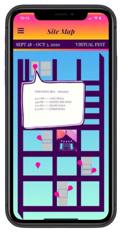
Attendees could click on these pink location icons to see the original plans for the festival - and view the schedules for each show
This map is an accurate representation of the actual downtown Bloomington, IN, centered around the towns iconic courthouse
IDEATION & WIREFRAMES
This project was my official introduction to the world of UX Design; therefore, these UI designs are the first "wireframes" I ever completed. I filtered feature requests from 10+ stakeholders and feedback from the 2 developers I was working with before putting this designs together.
UI Designs
BRANDING & UI

Desired brand perception
Surreal colors - during COVID-19, with notable landmarks to evoke a feeling of community and familiarity
Brand Adjectives
Trustworthy
Convenience
Knowledge
Safe
Approachability
Empowerment
Brand Story
Educate. Empower. Entertain.
HEADER 1
EDO
HEADER 2
Playfair Display
Body Text
Playfair Display
BRANDING & UI
#2eb2ff
#ffe000
#f62497
#4e057f
#c0b3fa
#8f1cc0
Defining the brand and user interface.
The MidWay festival brand changes every year, influenced by the previous year, current design trends, and our audience. However, the branding was particularly important during the 2020 festival - due to the COVID-19 pandemic and social distancing. To counter the distance between us, I was inspired by Bloomington, IN [where the festival took place] landmarks. I utilized surreal colors to encompass the surreal world of COVID-19.


My solution: Change the arrow to the icon that all users are accustomed to seeing with: a heart
01. The arrow isn't the familiar icon for saving items
PRIORITIZED REVISIONS


FINAL DESIGNS
An end-to-end, research-backed product.
OUTCOME & REFLECTION
As this project was my first exposure to the field, I found that it was sometimes hard to articulate my design decisions. This was also the first time I had set foot in Figma. Because of my excitement for UX, however, it was a breeze navigating these challenges.
My Challenges
We publicly launched the application roughly 3 weeks before the virtual festival on the Apple App Store and GooglePlay Store. MidWay Music Festival sold roughly 550 virtual tickets, and estimate a multitude of attendees per ticket [1 ticket = 1 household]. Attendees tuned in from all over the USA. The application was downloaded by roughly 20% of ticket-holders.
Results
"I felt like I was a part of something even though it wasn't in person." - Festival attendee & user
Project Outcomes
This was my first introduce to UX design. A part of me cringes when I look at my work in this one...and the other part of me is so proud and happy to have this experience that kickstarted my journey to UX Design.
Takeaways
Our solution: Put text on the "My Festival" page to inform users of its purpose: "Heart items from the lineup page to save them here and build your own lineup!"
02. User's aren't sure what the point of saving items is


Our solution: The new menu only take up half the page
03. The full-page menu was disrupting the experience


